


Articulate is the #1 authoring tool of eLearning courses. I came to the team to help the company move away from legacy desktop software and move to a cloud based subscription model. I primarily worked on the account management, subscription management and purchase flow portions of the new launch.
The Challenge
I knew that how the user navigated the different sections of account management was going to be key in allowing them to understand where they were and how they could get to where they needed. We have all probably tried to manage an account somewhere where once we drill down a few levels we have no sense of where we are anymore or how to get back. I was determined to avoid this.
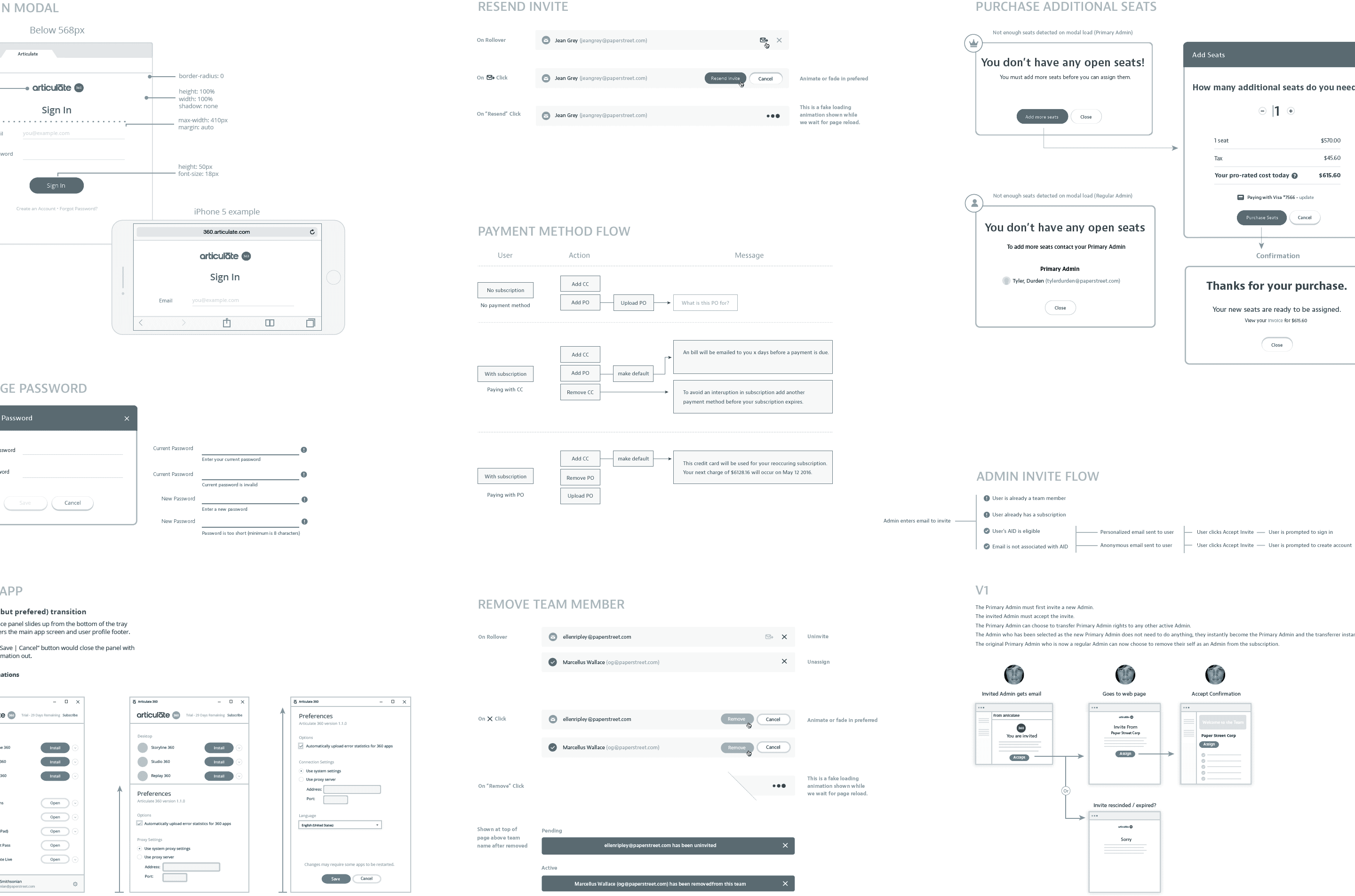
Additionally, users needed the typical functionality of managing billing, password and personal information along with needing to manage their Articulate software subscription. This could entail potentially complicated tasks like assigning and un-assigning seats and monitoring invites.
As part of the design process I started with a review of how industry standards had evolved around account management, which sites I thought worked well and which did not. From there I mapped out User Personas & User Stories before beginning the cycle of wireframes » mocks » prototypes » design reviews and finally technical documentation.
The first step in thinking about the account management section was to understand the needs of different users who would be accessing it as well as their motivations for doing so. Ultimately eight unique user types were identified, each with slightly different needs.
As an admin for the Articulate 360 team subscription purchased by her company Mia needs to be able to assign and un-assign “seats” to team members. She needs to monitor who has a seat, how many seats are available and any invites that are still pending.
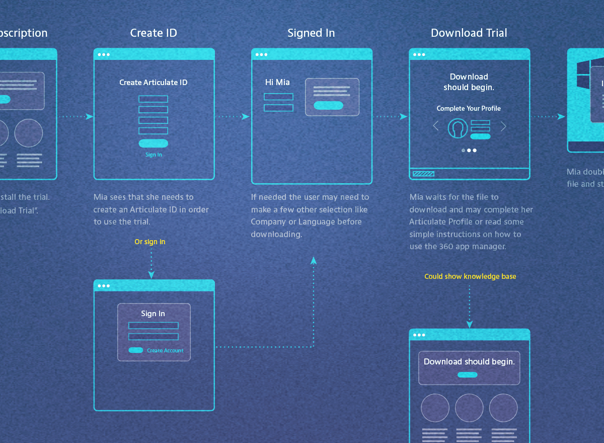
How are users arriving at Account Management? How do they navigate and what tools do they need? What roadblocks might they encounter? These and similar questions were best answered by combining the User Stories created earlier with the structure and flow that results from maping out the site architecture.
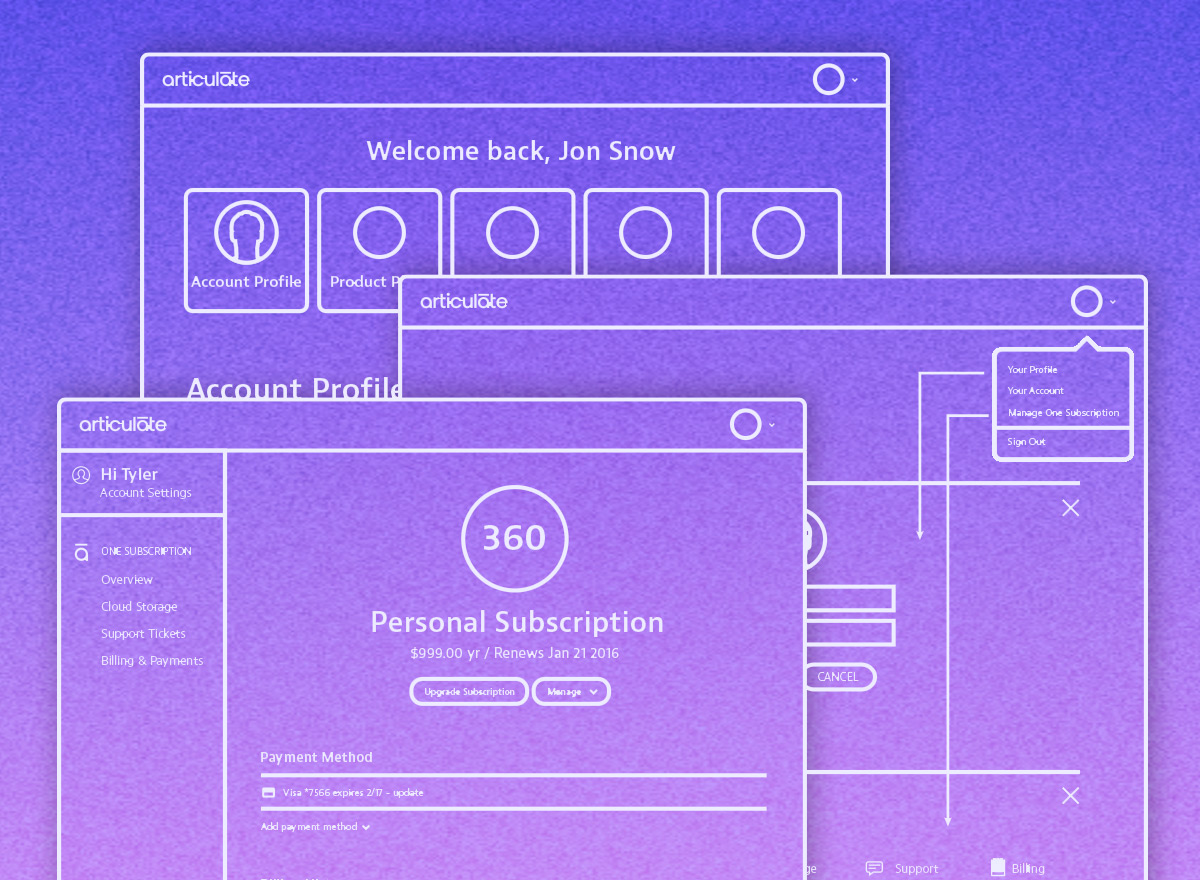
Navigation needs to allow the user to easily understand where they are and how to get to where they want. It also needs to be able to scale. A few concepts were explored but the side nav proved to address these needs best. Even though we were not able to user-test this design past research supports our decision.

The extra details and final fit and finish of the UI can take a design from good to great. Whether it is subtle UI animations or a refinement in the messaging, these details can add a lot to help the user understand what they can do or what has happened after they take action.
You can usually work through problems very quickly with wireframes or mock-ups but nothing lets you know how a UI feels more than a working prototype. Even a rough prototype can help you answer questions about how a UI should function and feel and can identify problems before handing off to development.
This is a very high level presentation of this project. If you would like to learn more about the work that went into this design or any of the other designs I have worked on please contact me below and I would be happy to talk about this project in greater detail.