Articulate is the #1 authoring tool of eLearning courses. I came to the team to help the company move away from legacy desktop software and move to a cloud based subscription model. I primarily worked on the account management, subscription management and purchase flow portions of the new launch.
The Challenge
Making an expensive software purchase is not usually an impulse buy so users who are ready to make this purchase are not usually deterred by steps like creating an account. My main objective was to make it as easy as possible for customers to enter their relevant personal and billing information as well as allowing the design to scale for users buying a team subscription or personal subscription.
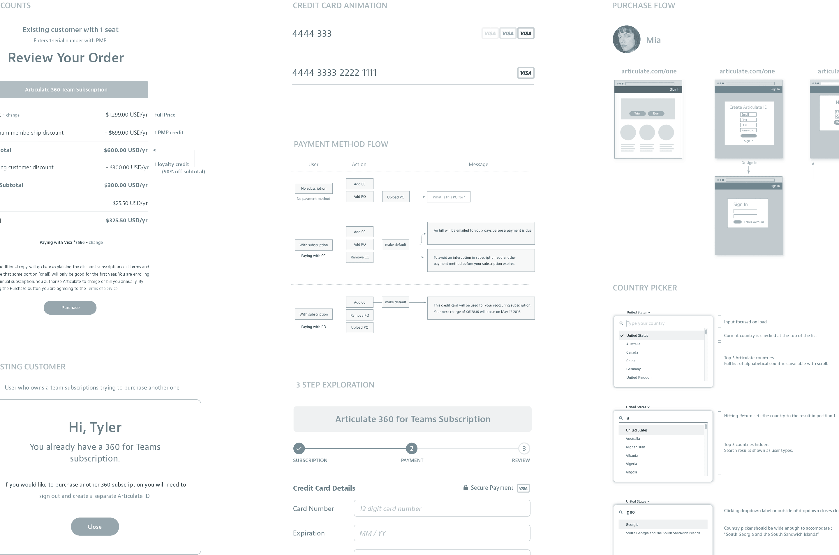
My initial focus when starting this project was to learn as much as possible about the different types of users who would be making purchases. Admins, students and re-sellers were some of the customers that would need to be considered. Having a good understanding of what would be required besides just a credit card was key in coming up with a design that scaled to all user’s needs.
The first step in thinking about the purchase flow was to understand the needs of different users who would be making a purchase. Not everyone who made a purchase would be an end user of the software.
Tyler will be the primary account holder who has access to all billing and the power to assign seats. Additionally Tyler can add admins who will have similar access to assign seats as well as purchase additional seats. This is important later on in account management but for now we know that Tyler needs to purchase multiple seats and enter billing information.

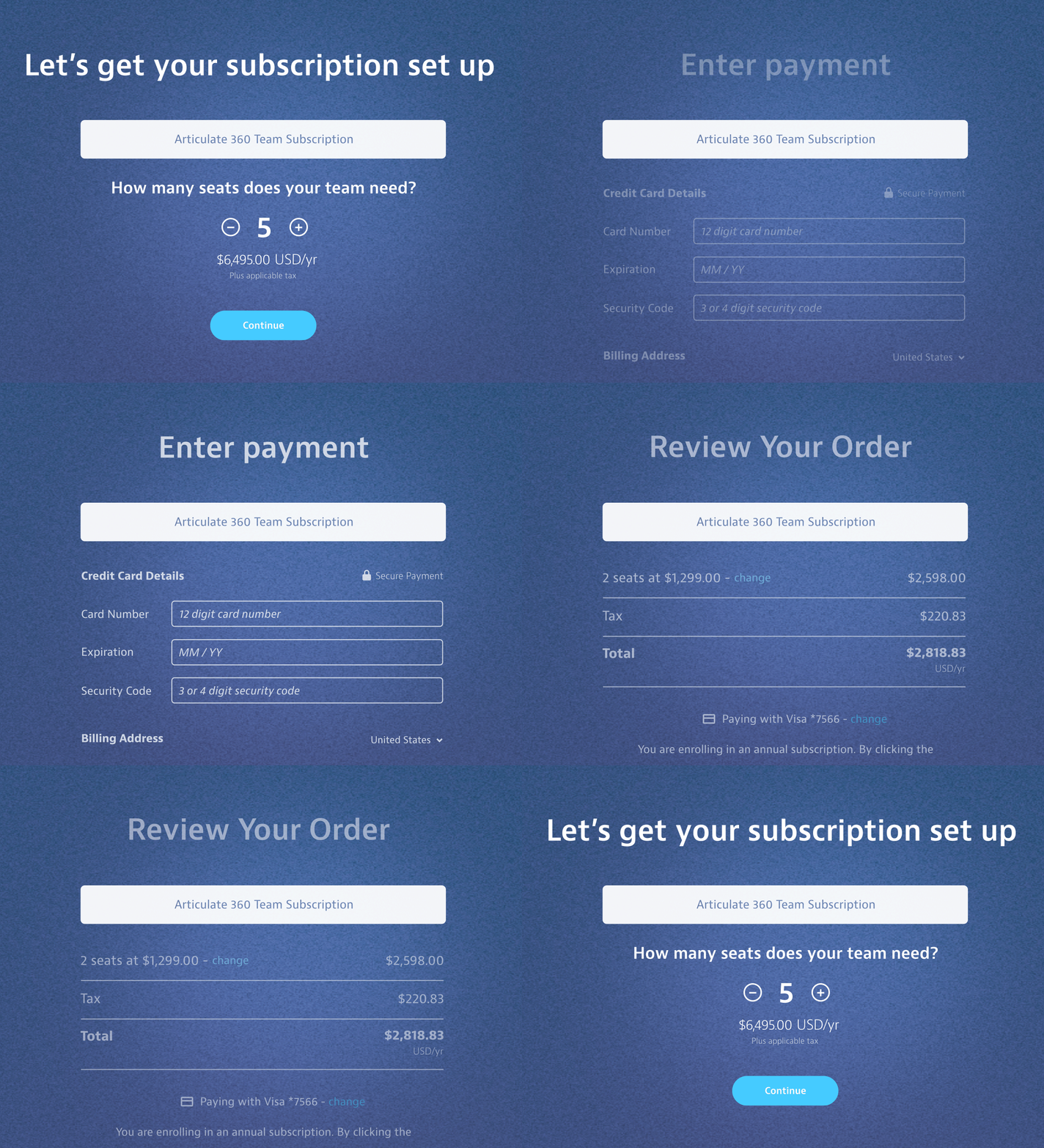
The plus and minus buttons work well for most use cases but why not give the user the option to manually enter a number. Not all users will discover this option but what a nice surprise for users who need to enter a larger number.

By keeping the heading and product name anchored the user can more easily keep their bearings when transitioning from one section to the next. Clear simple messaging in the heading helps this work even better.

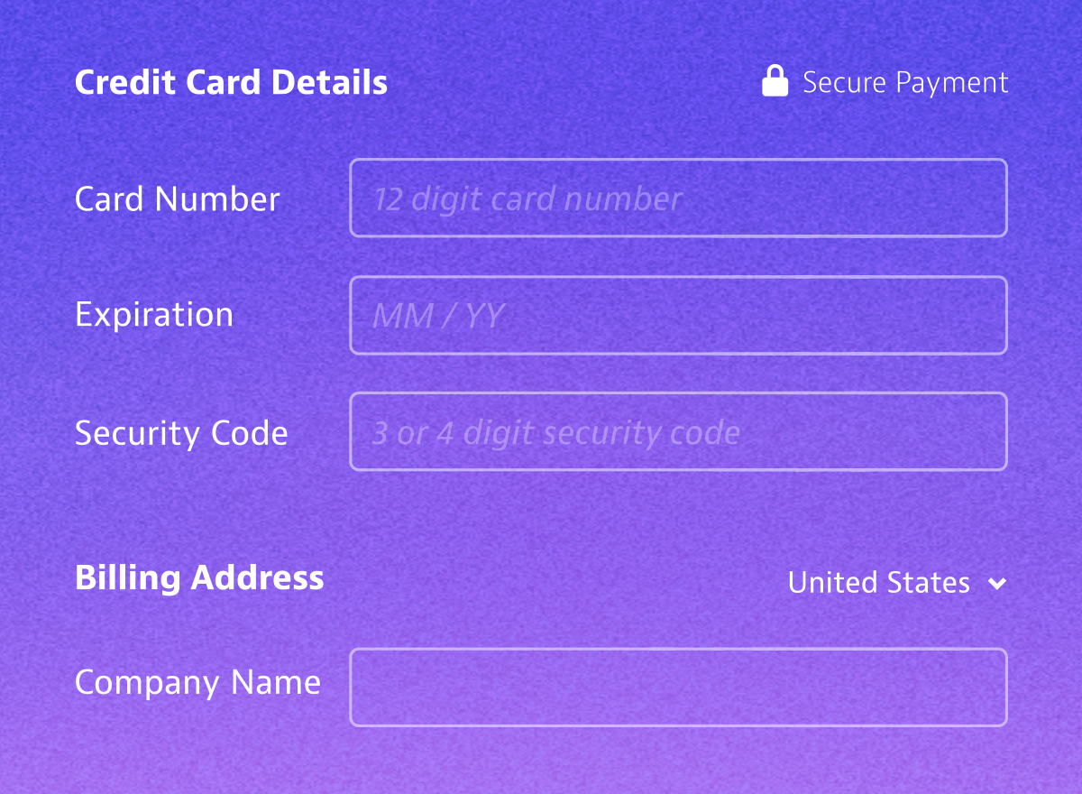
Designing clear and easy to use forms is not difficult but we can often over complicate a simple task by trying to make the forms fit a design aesthetic. Make the forms look nice but allow them to function as intended.

This is a very high level presentation of this project. If you would like to learn more about the work that went into this design or any of the other designs I have worked on please contact me below and I would be happy to talk about this project in greater detail.